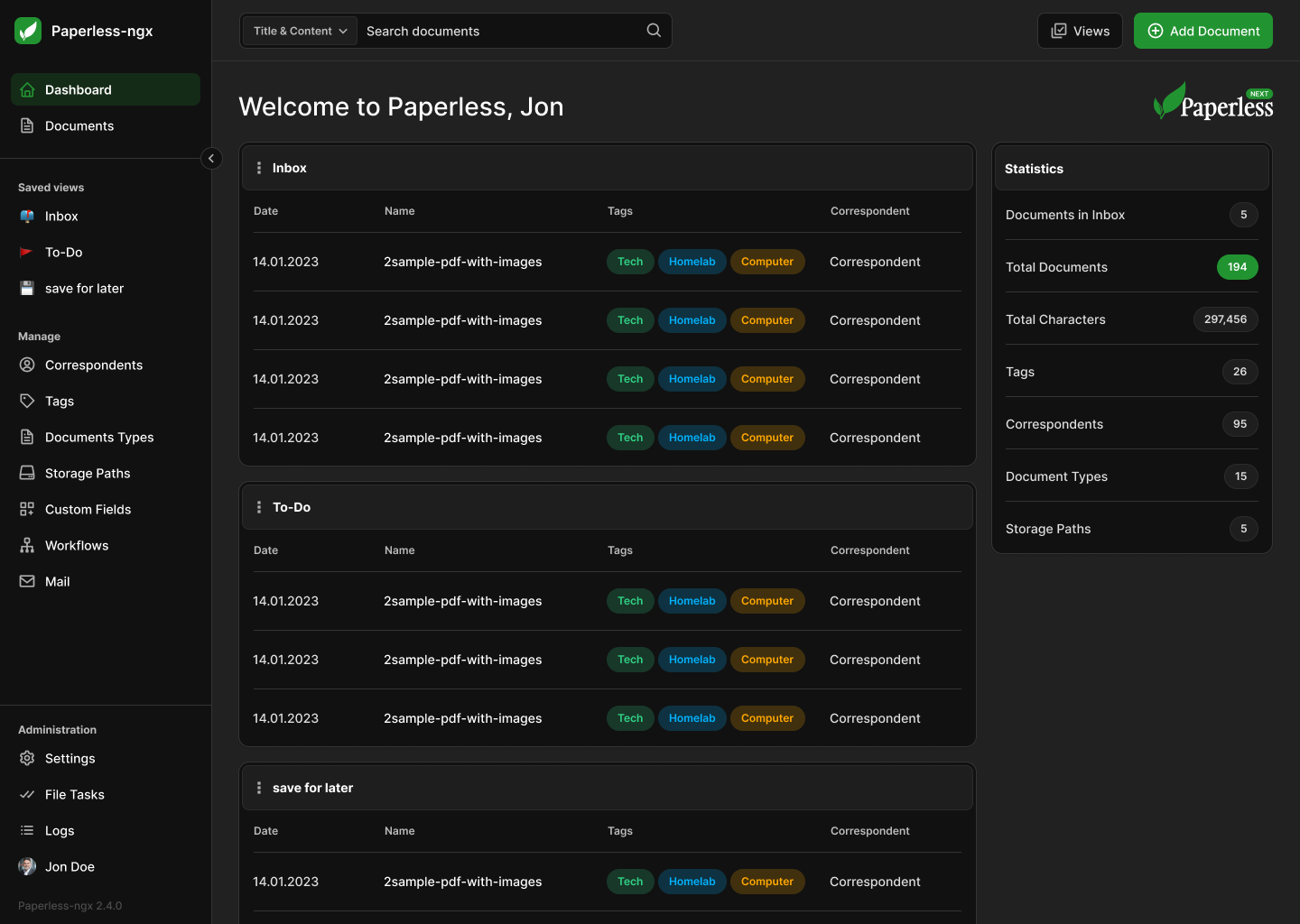
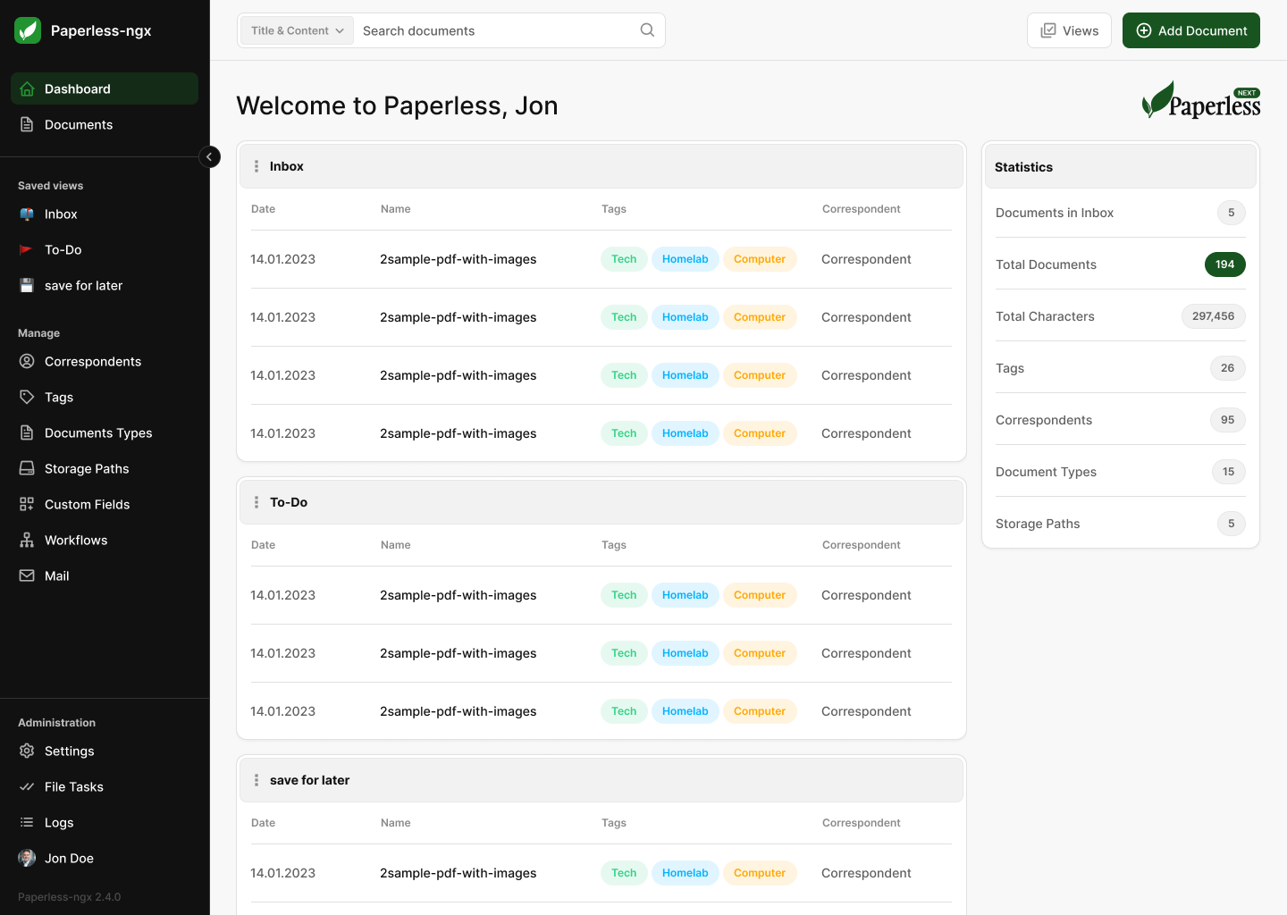
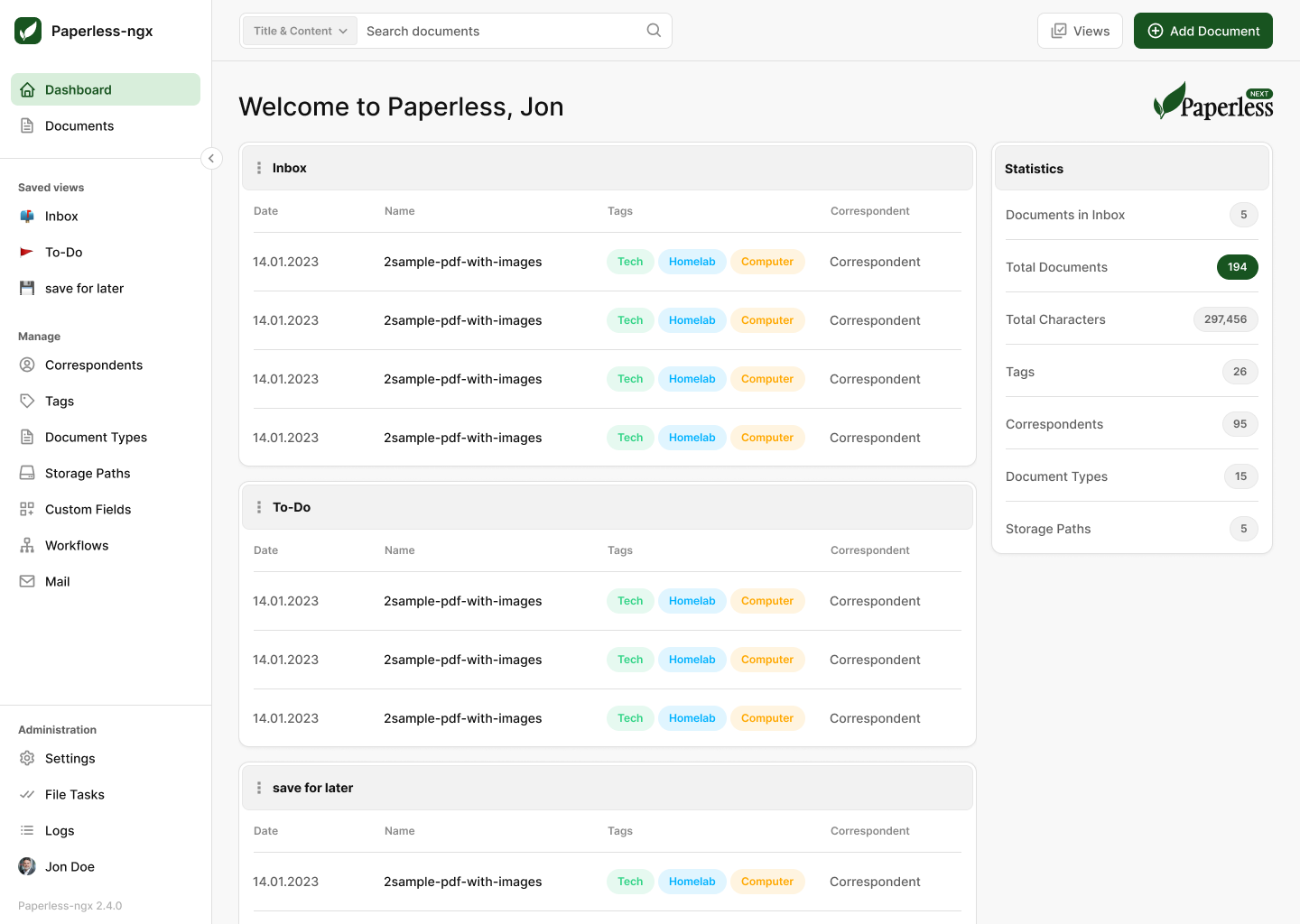
(Possibly) the next level for Paperless-ngx
I know, why change something that works? That's definitely the case, but while Paperless does a really great job at what it does, I think there's room for more. And to rethink the Status Quo is what kicks off community-projects like Paperless in the first place, so why stop there? With Paperless NEXT I am trying to come up with a more polished and functional interface that preserves all the established patterns, so it doesn't break muscle memory and therefore is easy to adapt.
More information at a glance
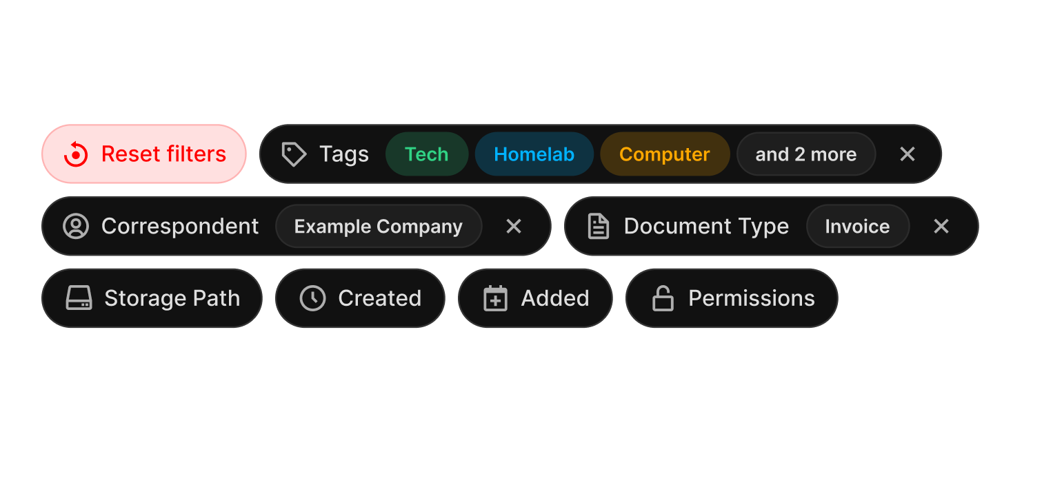
With the reworked tag-system it's now easier to see what's selected.
Focus on accessibility
Easier to read text and clearly defined areas that don't blur.
Preserving muscle memory
We don't like change, so almost everything is where it used to be.
More customization
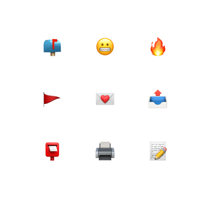
Choose your theme, highlight color and emojis for your saved views.
Cleaned up Interface
Elements that belong together are now grouped more logically.
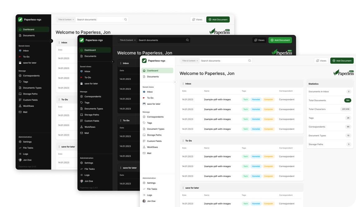
Multiple themes
Everything from dark to light and in between. Choose what works best for you.
Clean icon system
Pixel perfect icons to quickly identify ... and establish a visual hierarchy along the interface.
Known structure
Keeping everything where it used to be. Nothing gets hidden.
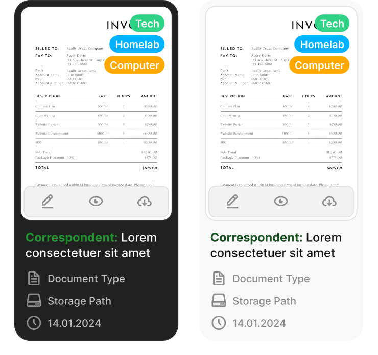
Everything at a glance
Tagging can get very fiddly. Now you can see everything you've selected at a glance and quickly iterate on what's shown.
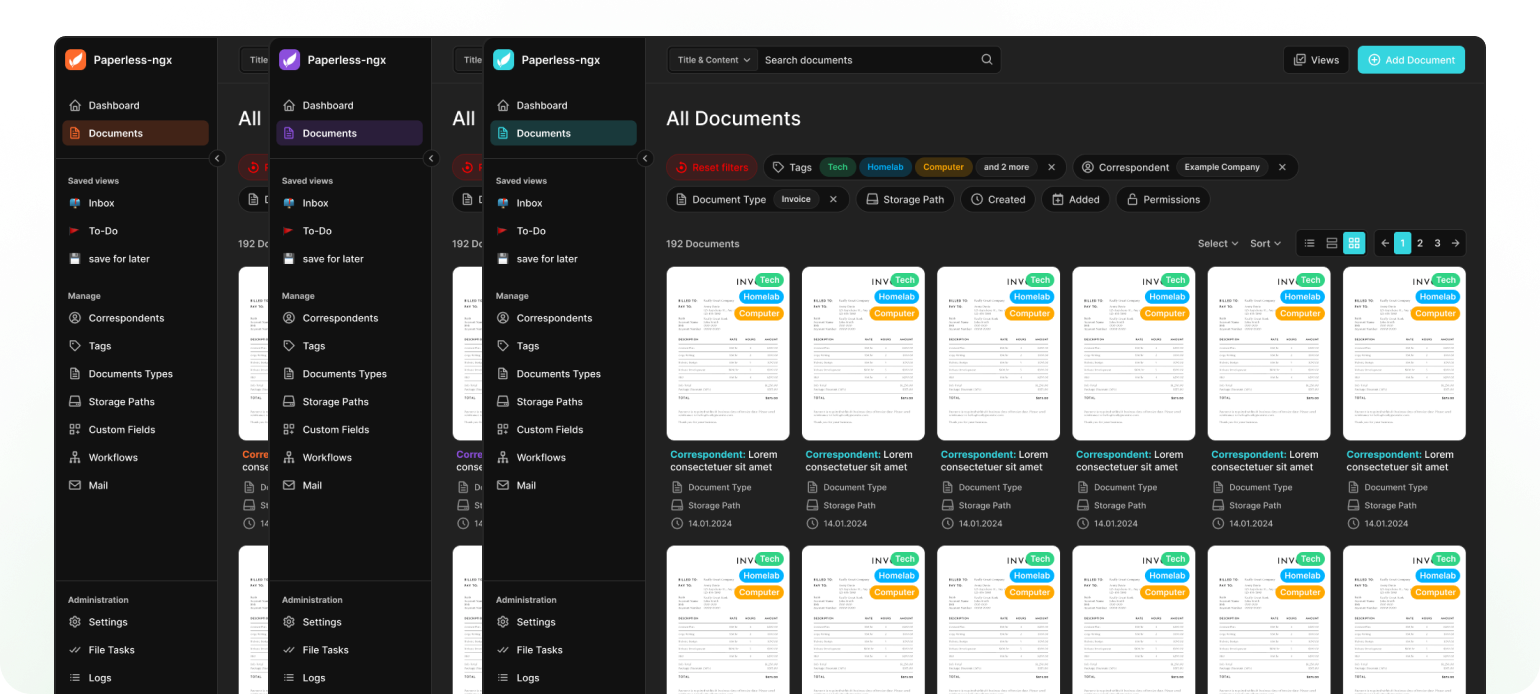
Make it yours
Naturally, the highlight color can still be changed to give you the option to customize Paperless-ngx to your taste.
Emojis FTW
Set apart your saved views with custom emoji support.
Right now, it's just a concept from a single guy that likes nice looking and good working software, but maybe I can get some people excited about the idea of what could be the next level for Paperless-ngx and bring more well-polished interfaces to the open-source community.
